
Artesia ISR teaches water survival skills to infants and young kids, and the founder came to me knowing her brand needed a refresh, but they weren’t quite sure how to bring it all together. So I teamed up with them to create something that captured their vibrant personality while still appealing to the safety and trust of their clients.
Artesia ISR wanted something that reflected their bold and playful nature of their classes, without relying on the typical splashy, cartoony water visuals. Most of all, they wanted a look that felt fun and inviting for kids, while still being trustworthy and professional for parents.
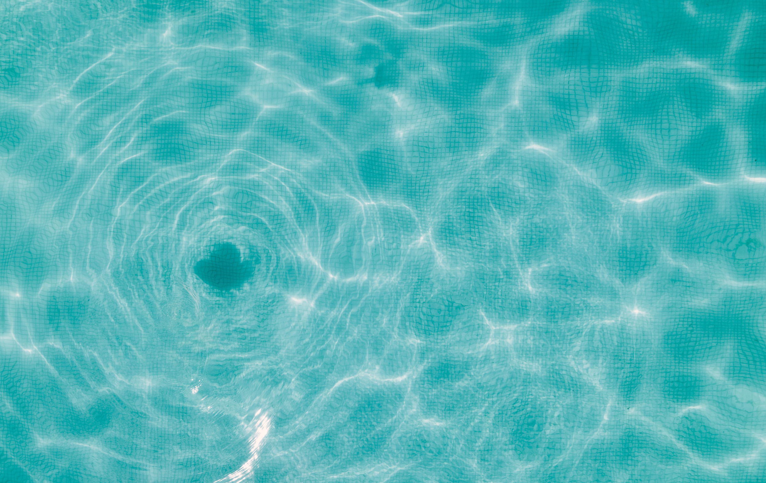
We started by defining the brand’s tone: playful but calm, safe but never boring. I used soft blues to build trust, paired with gentle greens that signal growth and safety. Custom illustrations inspired by water movement and summer play brought everything to life. The curves and flow of the brand system were designed to feel approachable, fluid, and full of purpose while still feeling organized and professional.
The final identity strikes that sweet balance between fun and functional, reflecting the warmth and energy of the brand while also giving parents confidence in the program.
Artesia ISR
Brand Identity:
Modern and approachable with child-like charm and a hint of professionalism.
Keywords:
Safety, vibrant, trustworthy, inviting, professional, calming.
Deliverables:
Logo suite, brand illustrations, brand colors, brand identity guidelines, and typography.


